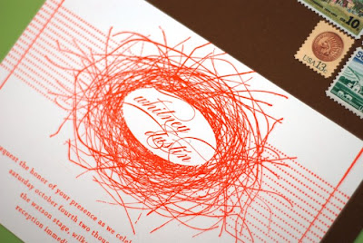
 Voila! Finally! We spent all of last night finishing our invitations and it was well worth it. All 110 of them complete :) I struggled for the longest time trying to decide what I wanted my invitations to look like, there is extra pressure when you are a graphic designer. I opted for the A6 size (for the stationery nerds out there) because I liked the feel of smaller pieces and also enjoyed creating my invite and postcard reply the same size. Because our wedding is in our hometown with everything happening at the same location, we were able to get away with only having two cards. I am very pleased with the results and am especially fond of our vintage stamps :)


Wednesday, July 9, 2008
Wedding Wednesday: Invite Preview
Subscribe to:
Post Comments (Atom)

19 comments:
wow! they are beautiful. i love all the attention to detail you put in each piece...and the color is great! congrats!
Gorgeous!!! Are you super excited??
I understand the extra pressure, and you know designing for yourself is really one of the most difficult things.
They are beautiful! I love the colour...sort of lobster-esque. Very very pretty.
Holy cow! Just. Pure. AWESOME!
My own wedding is September 13th and I have yet to finalize the invite design, let alone print them, because I HAD to have a map (graphic designers unite!). I still have 1 more week! But what size are you using for RSVP postcards? A2?
PS - love your design!
Whit,
The invites look amazing. I was excited to see what they would look like and you did not disappoint.
-Adrianne
I went with A2 reply postcards as well! I liked how all of the pieces were the same size.
Thank you for the wonderful feedback!! I can't wait to get them in the mail :)
incredible!! i absolutely love them!!!
these are beautiful! congratulations! the vintage stamps are a really nice touch. i also love how you have left room for people to add their comments and the rsvp card. i kept many rsvp cards from my own wedding and added them to the photo album that i made.
There are so great! I LOVE THEM and I love the colors!
Gorgeous! I'm blown away by your talent. What an awesome way to show your skills + make people feel special all at once. Really sweet...
Gorgeous! I hear you on the pressure–the options are endless when you are the designer. With a client, there is always something they need/want. This is what you want and that's hard to define sometimes!
Thank you so very much! I was nervous to post them :) Believe it or not, the color is a really bright orange, but I know the joy of colors and how they change on computer screens!
Oh, beautiful! I love them, love, love, love them!
I love them!
They are spactacular! I love that it is like a very chic nest - I need to import you to Australia - I just know your designs would be super popular xx
I stumbled across your blog today and absolutely adore it. Your invites are stunning. I love the orange
Did you Gocco these or letterpress? I likee!
I letterpress printed these guys! Thanks!!
Post a Comment